


PSA Ad
I decided to make my PSA Ad really simple after doing some research on PSAs. I read that they should be simple and quickly capture attention. I know that the PSAs that catch my attention are ones that shock me or get an emotional reaction out of me. After playing with different ideas like using facts and no pictures, using graphic pictures of accidents and what catch phrase I wanted to use in my ad I settled on my design. To me it’s powerful even in its simplicity.
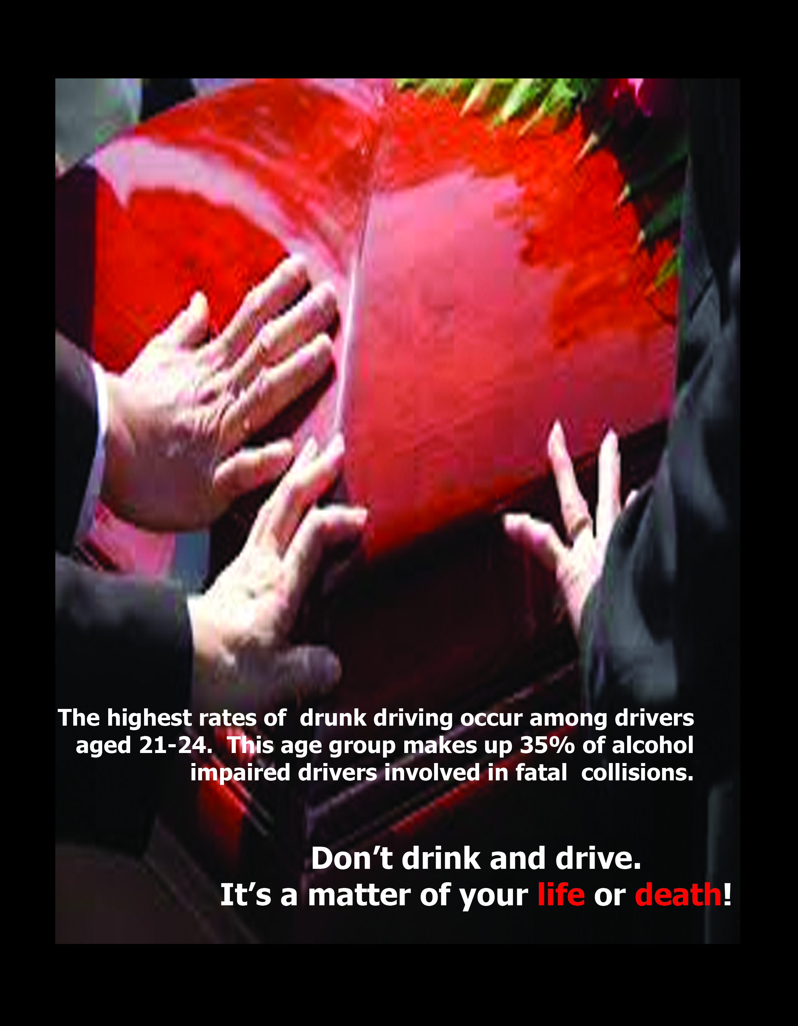
No one wants to image their own funeral so I thought this image would really get an emotional reaction out of anyone who saw it. Even though the image isn’t directly tied to drunk driving it still gets the point across that drunk driving is bad. It also raises awareness without drilling the same information people have heard a million times into their head again. I like the fact that the picture is a little out of focus because it makes the words stand out more.
For my design I followed all of the instructions on page 209- 218. After that I played around with Photoshop and a lot of different designs. To get this design, I got a picture off the internet and free transformed it to fit inside the magazine and I just added the layer with the words.