


My Magazine Ad
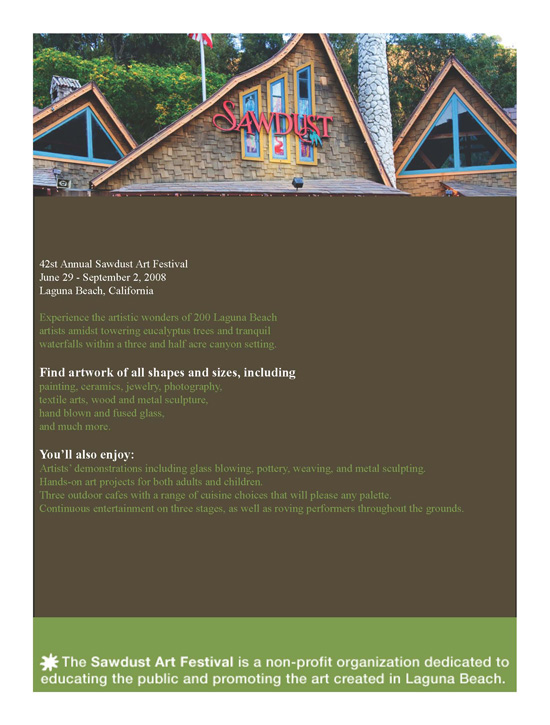
For this design I wanted to use the Sawdust Festival's website branding and incorporate it into the poster. I decided the best way to do this was to use the colors that were used on the website. I wanted to include as much information as possible about the festival without overwhelming the reader so I decided to just post text in the middle.
I decided to include a banner at the top of the page as well as a banner at the bottom of the page to draw the readers attention. The mission of the sawdust festival is very important so I wanted that to be something that was eye-catching incase it was a decision maker on if someone decided to attend. The banner at the top was to be the inital eye catcher and the image encouraged the reader to read the rest.
At this point in the class I did not know enough about using white space so if I had to do this project over again I would have changed the alignment of the words in the middle and maybe added a couple more shapes and font size changes.